What’s changed?
The new brand has been developed to help prepare even more young people with the skills they need to succeed in life whilst simultaneously making a positive impact on society. It builds on the work of the previous strategy, Scouting for All, and continues to focus on each of our four strategic areas, which are:
- Helping Scouting grow
- Being more inclusive
- Youth shaped
- Making a bigger impact in local communities
The Logo
Whilst the iconic fleur-de-lis has remained, the logo has been contemporised to align with the new brand. The guidelines confirm that the logo can be personalised at a local level with the addition of the name of the Group, District, County, Area or Region below it however should never be amended with additional wording; for example: “Tynemouth Scouts”.

As part of the new guidelines, it’s requested that for all local usage, regardless of location, on a purple or black background, the logo must appear in white. On a white background, the logo must appear in black or purple.
The Message
The new brand guidelines focus exclusively on skills for life – helping the public better understand scouting whilst simultaneously helping young people develop the character, employability and practical skills to succeed in life. The new visual identity promises to be easier to reproduce online and is supported by a wide range of tools and resources that can be found on the new Scout brand centre.
Brand Colours
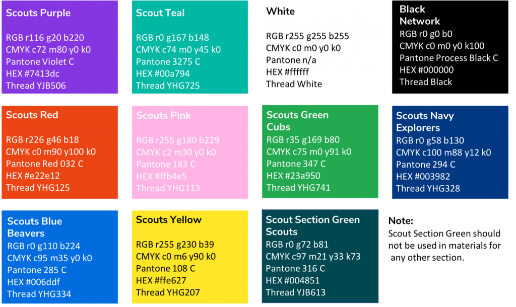
The new and improved colour palette offers eight primary colours, plus black and white. It is advised that each colour is used within isolation or in their respective pairs which are as follows:
- Scout Purple & Scout Teal
- Scout Red & Scout Pink
- Scout Green & Scout Navy
- Scout Blue & Scout Yellow

When using colour with an image, it is advised that you choose a colour from the palette that complements the image. You should limit the number of colours used in any single communication.
The Font
The chosen font is Nunito Sans which has been described by The Scout Association as being clean, contemporary and highly legible. It was chosen to express personality whilst remaining confident and inclusive.
Why has it changed?
The rebrand aims to propel the key benefit of scouting forward whilst equally modifying the beliefs of the public by portraying scouts in a more contemporary and relevant way.
The Scout Association said:
“The new visual identity and logo are easier to use in print and online and our brand font is now free. Above all, it works just as well locally as nationally, which is vital in supporting volunteer recruitment and communications in over 7,000 Scout Groups across the UK.”